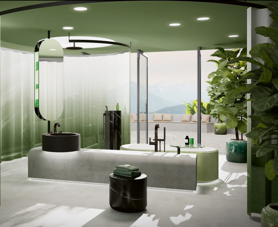
How do you feel when you step into a red room? What about a blue one? Or a green one? What does it make you think about? What emotion does it invoke? Does it encourage you to behave a certain way?
The impact of colour on psychology has been of fascination to people across the centuries. Much has been made of its effect on our emotions and behaviours, and in more recent decades those hypotheses and theories have been put to the empirical test.
Nature or nurture
A study in 2005 noted: “that in many non-human animals, including primate species, dominance in aggressive encounters (i.e., superior physical condition) is signalled by the bright red of oxygenated blood visible on highly vascularised bare skin. Artificial red (e.g., on leg bands) has likewise been shown to signal dominance in non-human animals, mimicking the natural physiological process.”
When it comes to colours in our surrounding environment, there continues to be some discussion as to whether certain colours invoke particular feelings or reactions because of a biologically engrained predisposition or because of ‘the repeated pairing of colour and particular concepts, messages, and experiences’.
A study from the University of Texas in 2015 found that “grey, beige and white offices induced feelings of sadness and depression, especially in women. Men, on the other hand, experienced similarly gloomy feelings in purple and orange workspaces.” It went on to suggest that “low-wavelength colours, like restful green and calming blue — two of the most common colours in Mother Nature’s palette — improve efficiency and focus.”
This not only taps into our discussion around biophilic design and its impact on wellbeing, but it also explains why the likes of chromotherapy (colour therapy) exist, and why wellness environments like spas often incorporate colour into other treatments.
Whether it’s nature or nurture, colour plays an important part in our world, and when it comes to our homes, it can be effectively used to create spaces that we don’t just like the look of, but that we like the version of ourselves in as well.
It’s personal
For us, one of the most fascinating things about colour is that we can never truly know what each person is seeing. What you see when you see ‘yellow’ might be entirely different to the colour we’re seeing. It’s for this reason that there isn’t really a right and wrong when it comes to colour choices in your home because ultimately, it’s your home, and the main goal is for you to feel good in it.
This high degree of personalisation makes colour choices an important chapter in designing our homes. As designers, we want to create the right mood for your personality, and to reflect the unique attributes of each client. However, we also want to enhance how you want to feel in your home.
That can be taken a step further if a client or member of their family is visually impaired or has a degree of colour vision deficiency (colour blindness). Colour can also be used to soothe or support individuals with learning disabilities as well. So, with that in mind, it can be an extremely powerful part of creating a home.
Colour in practice
Of course, we use colour in our projects all the time, and the discussions that we have with clients around that can be fascinating. It’s wonderful to see people drawn to certain colours; often actions really do speak louder than words.
In 2018, we won a Best Kitchen Designer Award for work that we did for a client who had an issue with his retinas. It meant that his eyes couldn’t adapt quickly to different shades and hues, and as he was the chef in the house, it was important to him that the kitchen was designed to make it easy for him to navigate. His preference was for everything to be white with little or no textural changes so that his eyes could relax, and he could best see what he was doing.
Of course, depending on your personality, colour can either be viewed as a trend or a way of life. If for you, it’s a way of life, we invariably find that people are more willing to go for bold colours over gentle ones. Those who are less confident might go for more neutral palettes, but bring in bolder colours in soft furnishings.
Either way, there’s no right or wrong, but there’s plenty to enjoy about choosing colours for your home. If you would like to speak to our team of Interior Specialists about elevating the use of colour in your home design, you can contact us any time or visit us at one of our studios.


